Authoring Tools
A tool is a folder. Drop it in tools/, add a tool.json + template.html, run npm run build:catalog to register it, done. (catalog/tools/index.json is generated from the manifests - never hand-edited; see Publishing.)
Authoring with AI Agents
If you have the lolly.tools repo in front of your agents, you can simply ask them to make tools for you using whatever challenge you think will resolve the design solution.
Sounds hard? not if you have the tokens and any source material. Lolly developers tested 600+ human-created logo lock-up combinations as separate svg files with only paths. They then directed agents to create a tool that could reproduce the source material.
One lunch-break later and the tool became real, and behaved to our satisfaction. Even if you rely mostly on this method, it's good to understand how tools operate.
Start from a design you already have
You don't always start from a blank manifest. If the layout already exists in Figma, Penpot, Illustrator or InDesign, bring it in with Layout Studio's Import a design button and skip straight to a working artboard.
A finished file - a native Figma .fig, a Penpot export, or any SVG (InDesign and Illustrator export it, and nearly every design app can) - is parsed on your device and lands on the free canvas as editable boxes: text stays retypable, shapes stay shapes, images join your library, and type and colours conform to the brand globals. From there it's an ordinary session, so it already behaves like a tool:
- Save it and it's a reusable template at a URL - anyone with Lolly can open, refill and render it - locked parts still locked - with no design app.
- Mix in other tools. Drop a QR code, a live chart, or another render into any box through the asset picker; embedded tools stay live and re-render on load.
- Render and scale through the same deterministic export path - SVG/PDF/PNG/video, the batch grid, Projects folders.
Import gets you the visual 90% without writing a line of tool.json. Reach for a hand-authored, fully declarative tool (sidebar inputs, hard-coded constraints, hooks) when you need those knobs - the anatomy below is that path.
Anatomy
tools/your-tool-id/
├── tool.json           # required - declares inputs, outputs, identity
├── template.html       # required - Handlebars-flavoured markup
├── styles.css          # optional - auto-scoped to #tool-canvas
├── hooks.js            # optional - imperative escape hatch
├── thumb.png           # optional - gallery thumbnail (recommended)
├── i18n/               # optional - <lang>.json string overlays (see Localizing a tool)
└── assets/             # optional - tool-local images, fonts, etc.
The manifest (tool.json)
Validated against schemas/tool.schema.json. Required fields:
id- lowercase, hyphen-separated, never changes once publishedname,descriptionversion- SemVer; bump on every changeengineVersion- SemVer range, e.g."^1.0.0"status-official|community|experimental. Experimental tools watermark every export (the host applies it - your tool does nothing). This is the positive counterpart to theprivacy: "on-device""no watermark" rule below.render- see Therenderblock below. At minimum{ width, height, formats }.inputs- array of input declarations (see below)
Optional:
capabilities-["network", "filesystem", "clipboard", "camera", "microphone", "ffmpeg", "wasm", "capture", "compose", "screen"]. Required for the host to expose those APIs to your tool, and what shells use to gate/label the tool where a capability can't be fulfilled. Tools without"network"cannot callhost.net.fetch- and a"network"tool must also declare which URLs (seenetwork, next); tools that usecomposes(below) declare"compose"; a tool that records audio throughhost.recorderdeclares"microphone".network-{ "allowlist": [...] }. The https URLshost.net.fetchmay reach, for tools with the"network"capability. Fail-closed: no allowlist, no fetch. See Network access.examples- example input value-sets that demonstrate the tool's range, rendered live as the gallery tile's preview strip. See Example looks.privacy-"on-device". Marks a content-transform utility that processes the user's own file entirely on the device. Shows the "Runs on your device - nothing is uploaded" badge; enforces (validated) that the tool is neverexperimentaland (at runtime) that exports carry no provenance metadata and no watermark. See thefileinput +exportFilehook below.hooks-{ onInit?, onInput?, onFrame?, onLevel?, beforeExport?, afterExport?, exportFile? }boolean flags. If any are true, you must shiphooks.jswith the matching functions. (exportFileis the transform path - file bytes in → transformed bytes out;onFramemakes the tool react to a live camera;onLevelmakes it react to live audio levels while recording - all covered below.)composes- embed another tool's render as an image (tool composition; see below). Requires the"compose"capability.a11yLabel- accessible description of the rendered output. The preview canvas is exposed to screen readers as a singlerole="img"; this is its label. It's a Handlebars string hydrated with the current input values (same context as the template), so it stays accurate as the user edits - e.g."QR code linking to {{url}}"or"Meeting plan for {{default count \"a\"}} people". Use{{default x \"fallback\"}}for empty inputs. Omit it and the label falls back to"<name> preview". Keep it short and factual - it replaces, not supplements, the canvas contents for SR users.
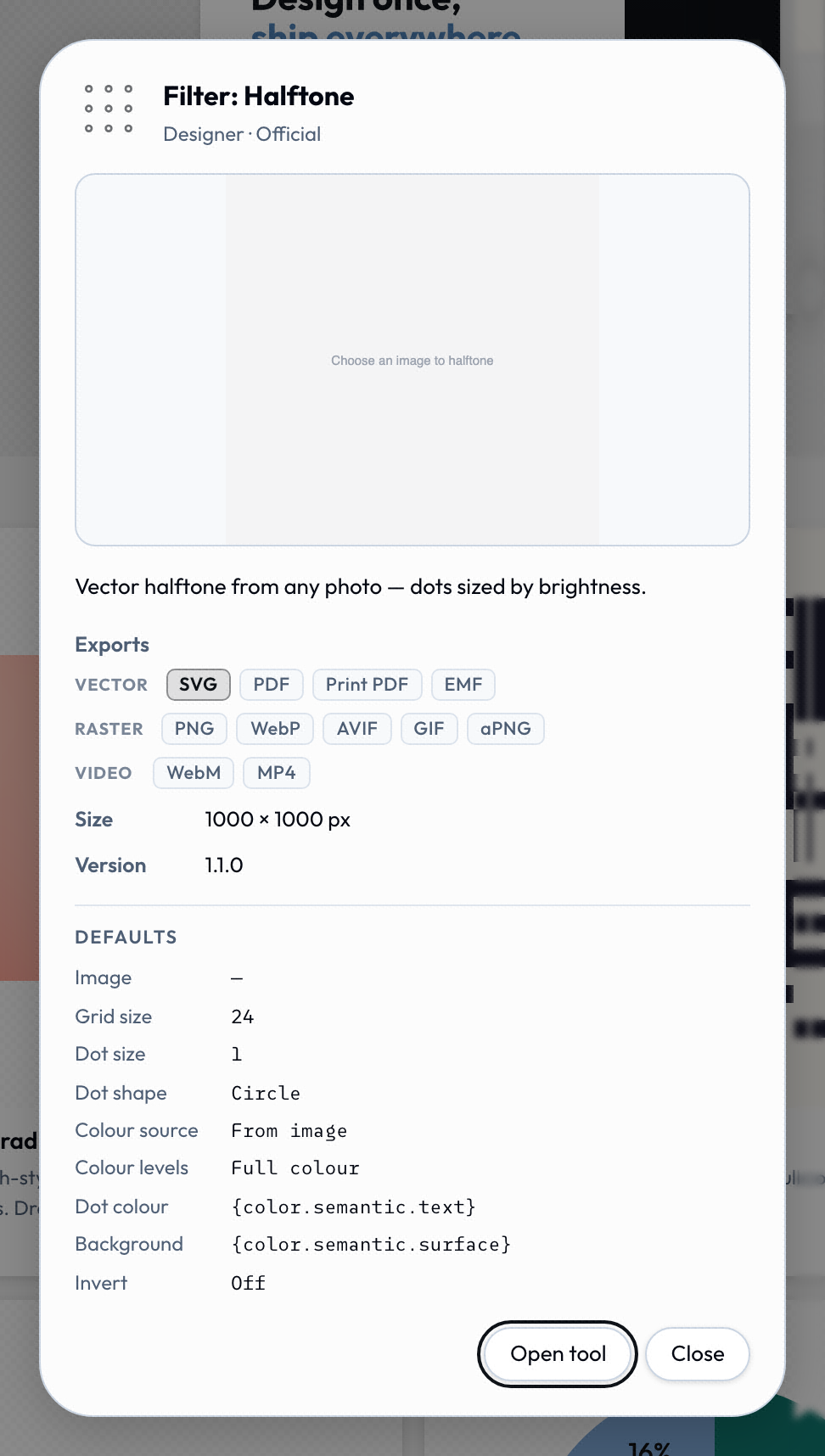
None of those fields stay private to the repo. The gallery's About card is the manifest read back to whoever is deciding whether to open the tool: name, category and status from identity, the export chips and canvas size from render, the version, and a capabilities line whenever the tool declared any.
The render block
Most of what render declares surfaces in one place the user sees: the export popup. Formats, page size and unit, the Convert paths outlining toggle and the Content Credentials card are all keys below.
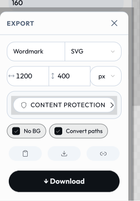
render carries width, height, formats (one or more of svg, svg-anim, emf, eps, eps-cmyk, dxf, pdf, pdf-cmyk, cmyk-tiff, tiff, pptx, png, jpg/jpeg, webp, avif, webm, mp4, gif, apng, webp-anim, html, md, txt, json, csv, ics, vcf, ico, zip), plus these optional keys:
actions- which action buttons to show. One or more ofcopy,download,save,share. Defaults to['copy','download','save']if omitted.export- setfalsefor utility/interactive tools with no export (hides the download/copy/format/dimension bar; shows Save only when the tool has inputs).layout-sidebar(default),canvas,editor, ordocument.canvashides the sidebar and presents the tool as a full-bleed working area; a single declaredfileinput becomes a drag-and-drop / click-to-pick zone on the canvas itself (used bystrip-data- drop a file → get a file back).editoris a chromeless free-canvas WYSIWYG surface: the sidebar is hidden but the render canvas and export controls stay, and the shell mounts a select / drag / resize / rotate / snap overlay driven by oneblocksinput whose rows carry acanvasgeometry flag (x/y/w/h/rotation). The shell also provides pasteboard behaviour for free: boxes dragged past the artboard stay visible and selectable (gently faded outside the frame, which keeps its shadow as the export boundary), while exports remain bounded by the canvas in every format - the tool template does nothing to opt in. The data stays flat and URL-expressible, so CLI and URL renders are identical.layout-studiois the reference tool.documentis a chromeless multi-page rich-text document surface for paged tools: likeeditorit keeps the render canvas and export controls, but the shell mounts a word-processor editor (an on-canvas format ribbon for paragraph style H1–H4 / bold / italic / lists / colour, per-block width/align/move/delete, click-to-edit contentEditable, and rich-HTML paste that becomes headings/lists/tables). It drives oneblocksinput (content) whose rows are content blocks (heading/text/lolly/table); pagination lives in the tool's hook (blocks flow into fixed-size[data-pdf-page]boxes, the same paged-export mechanismmulti-page-pdfuses), so CLI and URL render the same document with no editor.doc-studiois the reference tool.convertPaths- defaultstrue. When the tool exports a vector format, the engine auto-injects a "Convert paths" toggle that outlines text to vector paths (in SVG/PDF/PDF-CMYK) so the output renders identically without the fonts installed. Setfalseto suppress it and never outline - e.g. a capture tool whose output is raster (url-shot), or a tool that draws its text as raster/canvas before export (event-name-badge,wayfinding-signage).transparentBg- defaultsfalse. Adds a "No BG" (transparent background) toggle to the export bar; the engine injects it into the input model so hooks can react viaonInit/onInput(chart-creator).preview-{ format?, auto? }. Marks a tool whose live canvas is a placeholder until an explicit, expensive render runs (e.g. a capture tool that screenshots a page inbeforeExport); the shell wires a[data-preview]control.auto: truerenders one frame on load. Used byurl-shot.video-{ wait?, duration? }(seconds; defaults1/5). Capture timing used whenwebm/mp4/gif/apngis informats(bag-video).c2pa- defaultstrue(Content Credentials are opt-out). The Content Credentials card in the export popup is pre-checked for every stampable format (pdf,png/apng,jpg,gif,svg,tiff/cmyk-tiff,webp, zip members), so the finished file gets a signed C2PA manifest (on-device key, so viewers report it as an unverified credential). Setfalseto opt a tool out. Forced off forprivacy: "on-device"tools, which must never embed provenance into a user's own file. A?c2pa=link/save value overrides this per export.dims- setfalseto hide the export dimension inputs in the download bar.aspectWarning-{ min?, max?, message }. An editor-only amber caution shown in the Export popup when the chosen page aspect (width ÷ height) falls outside[min, max](either bound optional). It's purely a guard against picking a size that breaks the layout - it never appears in the exported output.multi-page-pdfdeclares{ "max": 1, "message": "…" }(portrait-only).
Physical units & print. width/height are values in the export's unit (px default, or mm/cm/in/pt), and dpi sets raster resolution for physical units. PDF exports a true page size; the CMYK formats (pdf-cmyk, cmyk-tiff) pair with the convertPaths outlining toggle to produce print-ready, fonts-not-installed output. A select option can also carry width/height/unit to drive the export page size from a dropdown - e.g. wayfinding-signage's Sign size select (A4/A3/A2… in mm) sets the printed page proportions when chosen.
printMarks- defaultstrue. Setfalseto opt a tool out of the single-page print-finishing card (crop/registration/bleed marks). Multi-page PDF tools set this because their output is a paginated RGB document, not a single marked plate.paged- defaultsfalse. Marks a multi-page document tool (one that lays out several[data-pdf-page]boxes, likemulti-page-pdf); the gallery renders each page as its own horizontally-scrollable preview slide rather than input-variant examples.pages-{ count, width, height, gap?, min?, max? }. Turns aneditor-layout tool into a multi-page canvas (the carousel-maker pattern): the shell sizes the canvas to a horizontal strip of N same-size page frames and the free-canvas overlay places boxes across all of them. Box coordinates stay one flat, global, URL-expressible array; the tool's hook derives which page each box belongs to and emits one[data-pdf-page]frame per page, so headless CLI/URL renders match and export fans out (multi-page PDF, or one still per page). Requireslayout: "editor"andpaged: true. Each property names the input id the geometry is read from (count/width/heightare number inputs), so the shell stays generic.
Multi-page PDF. A tool builds a paginated PDF by marking page boxes in its template with data-pdf-page - each flagged element becomes one true PDF page sized to its own CSS box, so a cover, content that flows across pages, and a back page render as real pages rather than one tall image. Pages are drawn as vectors (text outlined to paths) and the document can carry an open-password. The path falls back to the normal single-page renderer when no [data-pdf-page] boxes are present, and it bypasses the crop/bleed print-finishing path (pair it with printMarks: false). See the multi-page-pdf tool for the reference layout (cover + flowing blocks content + back page).
Example looks (examples)
A tool ships one committed thumbnail, but examples lets its gallery tile demonstrate range: an array of example input value-sets, each rendered live on the client (the same off-screen engine path an export takes) as a horizontally-scrollable preview strip - and, when the tool is featured, as the hero row's cross-fade. Each look is memoised, so later visits are instant. Omit it for a tool whose single committed preview says enough.
"examples": [
  { "label": "Launch teal",  "values": { "heading": "Ship it", "background": "#0c322c" } },
  { "label": "Reverse mark", "theme": "dark", "values": { "ink": "mono" } }
]- Key
valuesby inputid- never byurlKey. Example values seed the runtime the way batch-row values do: resolved by input id only. AurlKeyis URL-mode transport, so a urlKey-keyed value would silently render the tool's default look - and the validator errors on it. When transcribing a compact share link into an example, translate each short key back to its input id first. labeldocuments the look's intent (it isn't shown to end users).theme(light/dark) is only for looks that render ink on a transparent background (e.g. a reverse/white logo) - the clashing theme filters that look out of the strip; omit it when the look bakes its own background.width/heightinvaluesare honoured as per-example preview dimensions even when the tool declares no such inputs.- An
assetvalue must be a ref object, never a bare string:{ "source": "library", "id": "your/asset/id", "_unresolved": true }(optionally with a?theme=suffix on a themable icon id). Ablocksvalue is an array of row objects keyed by the block's declared field ids.
npm run validate:catalog checks every look: values keys must be declared input ids (a urlKey gets a pointed error naming the right id), catalog asset refs must exist (and any ?theme= suffix must name a real icon theme), blocks-row keys must be declared fields. It also warns when a tool declares looks but no gallery-displayable format (svg/png/jpg/jpeg/webp), and when a strip exceeds 8 looks - each look is a live render, so keep it to a handful of genuinely different ones.
The pre-examples alias featured.variants still renders but is deprecated - author examples.
Input types
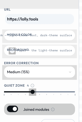
Each declaration becomes a real control, built by the shell from the input model - you never write the UI. Six lines of inputs in qr-code's manifest produce this entire sidebar.
| Type | What it produces | UI control |
|---|---|---|
text | string | text input |
longtext | string | textarea |
number | number | input or slider |
boolean | boolean | checkbox |
color | string (hex) | color picker, or constrained to a palette asset via palette: "asset/id" |
select | string (one of options[].value); an option may carry width/height/unit to set the export page size | dropdown |
asset | AssetRef object (id, url, type, etc.) | host-provided asset picker |
date | ISO date string | text input in the sidebar; native date field in the /pro grid |
time | HH:MM string | time input |
datetime-local | ISO datetime string | flatpickr datetime picker |
url | string | text input |
blocks | array of objects (repeating field groups) | add/remove/reorder row editor |
vector | object { fieldId: number } (a fixed set of numbers) | one row of zoom x/y controls |
file | a FileRef (the user's own file: name/mime/size/bytes) | file picker (on-device utilities) |
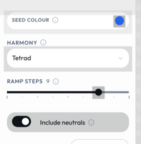
Four declarations of four different types are four different controls. color-palette declares exactly that and nothing else: a color, a select, a number and a boolean.
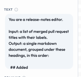
text and longtext differ only in the declaration, and the shell picks the control: a single-line field for one, a sized textarea for the other. prompt-to-image's prompt is a longtext.
The three moment types (date, time, datetime-local) are real input types with real controls, but no tool in the open community set declares one, so there is no screenshot of them here.
blocks - repeating groups
A blocks input is a list of repeating sub-records (e.g. team members, each with a name and city). Declare the per-row fields under fields:
{
  "id": "people",
  "type": "blocks",
  "label": "Team members",
  "fields": [
    { "id": "name", "type": "text",  "label": "Name" },
    { "id": "city", "type": "text",  "label": "City" }
  ]
}
In the template, iterate with {{#each people}}…{{/each}}. The value round-trips to the URL as a JSON array (see docs/url-mode.md); rows larger than ~8 KB fall back to saved-state slots. Blocks are edited in a side panel, and clicking a rendered block on the canvas focuses that block's field. meeting-planner is the reference implementation for the simple (homogeneous) case.
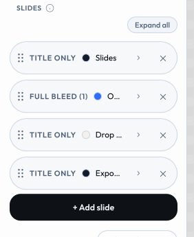
Advanced blocks (typed / heterogeneous rows). Sub-fields aren't limited to text - a field may be text, color, select, asset, number, or boolean. And the row set can be discriminated by a select sub-field:
addMenu: { field, label }turns the "+ Add" button into a typed menu - each option of the named discriminator sub-field becomes a menu entry. The discriminator is fixed at creation and shown as the block's label rather than an editable control. An entry already used is disabled unless its option setsrepeatable: true.showFor: ["kind"]on a sub-field limits it to blocks whose discriminator value is listed.multilineFor: ["kind"](with optionalrows) renders a text sub-field as a textarea for those discriminator values.
color-block is the reference for typed/heterogeneous blocks (addMenu keyed on a kind select, showFor, multilineFor, and the full sub-field type set).
Drop files to add rows. A blocks input may declare dropToAdd: { field, accept } - dropping one or more files onto the blocks list appends one row per file, uploading each into the named asset sub-field (the row's other fields start at their defaults). accept is a MIME filter (default image/*). logo-wall is the reference: drop many logos → one block each.
Paste a Markdown document (mdPaste). A blocks input may set mdPaste: true to add a Paste Markdown button to the blocks toolbar: it reads the clipboard, splits the Markdown into one block per heading (heading line → the block's heading field, the section beneath → its body field, kept as Markdown for a {{markdown}} render), and appends the blocks - so a whole document lands as editable, page-flowing blocks. Used by the paged/document tools.
Import rows from a spreadsheet (importData). A blocks input may declare importData: { formats?, mode?, columns? } to offer an Import data button that fills the whole list from a CSV or JSON file - the ingest counterpart to CSV/JSON export. The engine (parseDataRows) maps columns onto the block's sub-fields: an explicit columns map ({ fieldId: "Column Name" }) wins, otherwise each column header/key is matched case-insensitively to a field's id then its label. formats limits the accepted types (default both); mode is replace (default) or append. JSON may be an array of objects, an array of arrays (positional, in field order), or { "data": [ … ] }. The imported rows are ordinary blocks - they serialise to the URL and save like any hand-entered data. chart-creator is the reference: import a two-column Label,Value sheet to chart it.
Reference pickers (optionsFrom). A sub-field can be a dropdown whose choices are the rows of another blocks input - so a row references another row by a friendly name instead of a hand-typed id. Declare optionsFrom on the field:
{ "id": "parent", "label": "Reports to",
  "optionsFrom": { "input": "nodes", "value": "nodeId", "label": "label",
                   "excludeSelf": true, "excludeDescendants": true, "emptyLabel": "- Top level -" } }
The value stored is the target row's derived id - slug(value field), else slug(label), else an ordinal, de-duplicated - i.e. exactly the id a hook resolves with (your hook should slug both a row's id and the back-reference, so the two agree). A stored value matching no current row is shown as a selected "(unknown)" option rather than vanishing, so a stale reference is visible. Options: value/label/prefix (the source sub-fields + ordinal prefix), sources: [{input,value,label}] to merge several inputs (e.g. cards and layers, de-duped by value), freeText: true for a combobox (datalist) that also accepts a typed-in value (e.g. a new kanban column), excludeSelf, excludeDescendants (needs nesting, below), and emptyLabel.
Tree blocks (nesting). A blocks input can be edited as a tree: the sidebar renders the flat array as an indented outline (pre-order) and the header drag drops a card above / below (sibling) or inside (child) another, updating its parent reference - the whole subtree travels with it. The data stays a flat reference-by-id array, so it serialises and renders exactly as before (the renderer still walks the parent pointers). Declare nesting on the input:
{ "id": "nodes", "type": "blocks", "nesting": {
    "parentField": "parent", "keyField": "nodeId", "labelField": "label",
    "activeWhen": { "diagramType": ["org", "mindmap"] } } }
activeWhen gates tree mode by top-level input values (an array value matches by membership); omit it to always nest. diagram-builder is the reference for both optionsFrom and nesting (org / mind map nest; process / kanban / layercake stay flat and reference by picker).
Editor canvas: connectors, grid & fixed size (canvas.connect / grid / fixedCanvas)
A blocks input carrying a canvas object is the free-form WYSIWYG artboard behind render.layout: "editor" (see The render block): its *Field keys map each row's geometry (xField/yField/wField/hField/rotationField, plus fill/text/image sub-fields) so the shell can mount its select / drag / resize / rotate overlay while the data stays a flat, URL-expressible array. The shell mounts the whole editor rail for you - add, arrange, undo and the primary export actions - so the manifest declares geometry fields and nothing else.

Three of the canvas keys turn a plain box canvas into a diagram editor:
grid-{ size, default }. Opt into snap-to-grid: the overlay rounds drag/resize to a lattice ofsizecanvas px, starting on whendefaultis true (per-axis alignment guides still win; holding Alt disables the snap).fixedCanvas-truelocks the canvas torender.width/render.height: the shell withholdssetCanvasSizeand ignores reserved?width/?height, so box coordinates stay 1:1 with the render size. Required whenever a hook draws into a fixed-viewBox overlay - e.g. connector arrows in an<svg>sized to the artboard.connect- opts into connector authoring: a Connect-mode rail button (click a source box, then targets), a live connector preview, and an Auto-arrange (tidy-tree) button. Edges are stored as rows of a _second_blocksinput named byinput; the tool'shooks.jsreads that array and renders the arrows (as an SVG of filled paths - one artboard-sized<svg>per theorg-chartpattern). The*Fieldkeys name sub-fields of that connectors block:
``json "connect": { "input": "connectors", "fromField": "from", "toField": "to", "styleField": "style", "arrowField": "arrow", "headField": "head", "colorField": "color", "dashField": "dash", "widthField": "width", "layerClass": "oc-connectors", "defaultStyle": "elbow", "defaultArrow": "end", "defaultHead": "triangle", "defaultColor": "#94a3b8", "defaultWidth": 2.5 } ``
fromField/toField(defaultfrom/to) hold the source and target box ids.styleField- route flavour select (straight/elbow/elbow-v/elbow-h/elbow-src/elbow-tgt/curved).arrowField- which ends carry an arrow (none/end/both);headField- arrowhead shape (triangle/open/circle/diamond/bar).colorField(color) /dashField(solid/dashed/dotted) /widthField(number, px) - the edge's line styling.layerClass- the CSS class on the tool's rendered connector<svg>, which the shell hides mid-drag while it paints its own live preview.default*(defaultStyle/defaultArrow/defaultHead/defaultColor/defaultWidth) - the values a newly-drawn edge starts at.
org-chart is the reference implementation: an editor-layout box canvas with grid, fixedCanvas: true, and a connect writing to a connectors blocks input whose rows its hook turns into one artboard <svg> of arrows.
vector - a group of numbers as one control
Use vector when a few related numbers belong together - zoom + pan, an x/y offset, padding, margins. Instead of separate number inputs (one column each in /pro bulk mode), a vector is one input, one control, one column: a row of compact number fields where each label can be dragged to scrub the value (Figma-style) or typed into. Declare the numeric sub-fields under fields:
{
  "id": "imageFraming",
  "type": "vector",
  "label": "Zoom & Position",
  "fields": [
    { "id": "zoom", "label": "Zoom", "min": 100, "max": 400, "step": 1, "default": 100 },
    { "id": "x",    "label": "X",    "min": 0,   "max": 100, "step": 1, "default": 50  },
    { "id": "y",    "label": "Y",    "min": 0,   "max": 100, "step": 1, "default": 50  }
  ]
}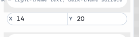
The value is an object keyed by field id, so the template reads each part with dot access: {{imageFraming.zoom}}, {{imageFraming.x}}, {{imageFraming.y}}. Each field clamps to its own min/max and falls back to its default.
In URL mode (and /pro CSV) each field is its own flat param/column, namespaced "<inputId>.<fieldId>" - e.g. ?imageFraming.zoom=200&imageFraming.x=30&imageFraming.y=70, or CSV columns imageFraming.zoom, imageFraming.x, imageFraming.y. There is no urlKey on a vector. filter-duotone and quotes (both imageFraming) are the reference implementations.
imageFraming is a canonical input (see below) - reuse that id and field set verbatim for any zoom/pan-an-image control rather than inventing a synonym.
asset - library or device upload
An asset input opens the host's asset picker and stores the chosen AssetRef - uniform whether it came from the catalog or the user's device:
{
  "id": "logo",
  "type": "asset",
  "label": "Logo",
  "assetType": "image",    // vector | raster | image | video | lottie | any - constrains the picker
  "allowUpload": true       // also let the user add an image from their device
}
assetType constrains what the picker offers: raster (bitmaps only), vector (SVG only - for inline-recolourable logos), image (any still image - raster _or_ vector, the right choice for a generic picture slot), video, lottie, or any (everything, including non-image assets). Prefer image over raster for photo/illustration slots so users can also pick or upload SVGs.
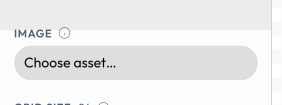
When allowUpload is true, the picker offers the user's personal image library alongside the catalog. Users add images from their device; the host downscales each to 3840px on the longest edge, re-encodes it (WebP, with EXIF/GPS metadata stripped), and stores it locally (IndexedDB on web and Tauri). The library is capped (currently 50 images), reusable across tools, and managed in Profile → Storage → My images. SVG uploads are sanitised on ingest (script/handler stripping) and pass through without rasterising.
These images are device-local: their AssetRef.source is "user" and their user/… id is meaningful only on the device that holds the bytes, so they are omitted from shareable URLs (see docs/url-mode.md). Tools treat user and library assets identically - no tool code is involved in the upload.
Use any tool as an image (paste a Lolly link). Every asset input also accepts a Lolly tool link pasted into the picker's search box - a share link copied from another tool (…/#/tool/qr-code?url=…) or an embed URL (…/tool/qr-code.svg?…). The host renders that tool (via host.compose) and drops the result into the slot; the user can pick the render format and size before committing. This is the end-user counterpart to authored composes (below) - no manifest declaration needed, and it works in every tool's image inputs by default. The picker offers SVG and bitmap render formats for any image slot (SVG is the default - it stays crisp and inlines as true vector in SVG/PDF export, and rasterises cleanly for PNG); a vector-typed slot is restricted to SVG. The chosen asset's identity is the canonical embed URL, so it persists in saved sessions and shareable links and re-renders on load - exactly like a library id. (The picker offers this whenever the shell can compose; the compose capability gates only authored composes, not this end-user path.)
file - the user's own file (on-device utilities)
A file input takes a file the user picks into memory and hands its raw bytes to the tool. It's the input shape for content-transform utilities - the "boring file jobs you'd otherwise hand to a stranger's website": strip EXIF, crop, compress, convert. Unlike asset (which is for brand imagery and goes through the catalog/upload library), a file is the user's own content that's processed and handed straight back, never stored or uploaded.
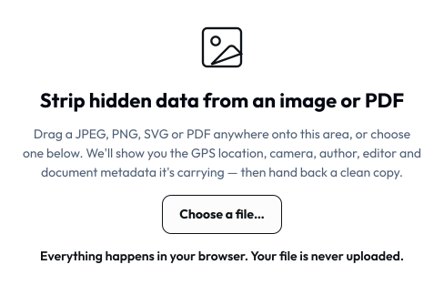
With layout: "canvas" a single file input stops being a sidebar row and becomes the working area itself - the drop zone strip-data opens with.
{
  "id": "photo",
  "type": "file",
  "label": "Photo",
  "accept": ["image/jpeg", "image/png", ".jpg", ".png"],
  "maxSize": 52428800
}accept- allowlist of MIME types and/or extensions for the picker (a UX hint; still validate bytes in the hook). Omit to accept anything.maxSize- max bytes; the host rejects larger files at pick time.
The value is a FileRef: { __file: true, name, mime, size, bytes, url }. The bytes are a Uint8Array the hook reads directly (no host. call - the bytes ride in the value by design, because the portable host. surface has no file-read API). A file value is never serialised into a URL (binary has no shareable form) and never persisted - it lives only in memory on the device, which is the whole privacy point. In CLI transport a file param is a path the runner loads: --photo=./pic.jpg.
Producing output: the exportFile hook + privacy: "on-device"
A content-transform utility doesn't rasterise the canvas - it produces a transformed file. Declare the exportFile hook and mark the tool as an on-device utility:
{
  "status": "official",
  "privacy": "on-device",
  "render": { "width": 760, "height": 620, "formats": ["jpg"], "export": false, "actions": [] },
  "hooks": { "onInput": true, "exportFile": true }
}
privacy: "on-device"shows the "Runs on your device - nothing is uploaded" badge and enforces (validated) that the tool is neverexperimental, and (at runtime) that exports carry no provenance metadata and no watermark - you must not stamp anything into a user's own file.render.export: falsehides the standard format/size/download bar;"actions": []opts out of the default Save/Share buttons (saving would persist the user's bytes - never do that).- The
exportFilehook reads the picked file and returns the transformed bytes as a plain record:
function exportFile({ model }) {
  const inputs = Object.fromEntries(model.map(i => [i.id, i.value]));
  const f = inputs.photo;                       // the FileRef
  const cleaned = stripMetadata(f.bytes);       // your transform (pure bytes → bytes)
  return { bytes: cleaned, mime: f.mime, filename: f.name.replace(/(\.\w+)?$/, '-clean$1') };
}
In the template, a <button data-export-file>Download…</button> triggers the hook; the shell wraps the bytes in a Blob and delivers them via host.export.file (download on web, --output on the CLI). Use onInput/onInit to return extras the template displays (e.g. what metadata was found). strip-data is the reference implementation.
bindToProfile
Any input can declare bindToProfile: "firstname" (or email, headshot, etc). When the tool mounts, it pre-fills from the user's profile. They can override per-session.
Canonical inputs (reuse shared ids)
/pro (the web shell's batch mode) is a spreadsheet grid that renders many rows at once across one or many tools - CSV/TSV round-trip and spreadsheet paste in, a .zip of per-row outputs out, with collapsible export columns and saved batch sessions. Because it lays every selected tool's inputs out as a grid, the id/constraint choices you make below directly shape that grid.
/pro batch mode lays every selected tool's inputs out as a grid. It keys each column by input id - so two tools that call the same concept by the same id collapse into one column, and if they also agree on type + constraints (number min/max/step, select options, color palette), that column becomes bulk-writable: the user types one value and it fills every row. Diverge on the id (or the constraints) and you get a separate, cell-by-cell column instead. So picking a shared id is a real UX decision, not a style preference.
To make this the default path, the blessed ids and their constraints live in schemas/canonical-inputs.json. When your tool needs one of these concepts, copy the id (and constraints) verbatim:
| Concept | Canonical id | Type |
|---|---|---|
| Headline | heading | text |
| Sub-headline | subheading | text |
| Body copy | body | longtext |
| Call to action | cta | text |
| Ink / foreground colour | color | color |
| Background colour | background | color |
| Primary image · portrait · backdrop | image · headshot · bgImage | asset |
| Background image dimming | bgOpacity | number (0–1, step 0.01) |
| Zoom + pan an image | imageFraming | vector { zoom, x, y } (zoom optional) |
Conventions: per-element typography numbers are <element>FontSize / <element>FontWeight (weight 100–900 step 100), e.g. headingFontSize, bodyFontWeight.
Labels are advisory - show whatever label fits your tool; the /pro header just uses the first non-empty one, and bulk-write only cares about id + type + constraints. Adding a genuinely new shared input? Add it to schemas/canonical-inputs.json first, then adopt it - npm run validate:catalog emits a warning (never an error) when a tool uses a canonical id with a divergent type or constraints, so drift stays visible.
The template (template.html)
Handlebars-flavoured. Logic-less by design.
<div class="my-tool">
  {{#if heading}}
    <h1>{{heading}}</h1>
  {{else}}
    <p>(enter a heading)</p>
  {{/if}}

  {{#if logo}}
    <img src="{{asset logo}}" alt="" width="{{asset logo "width"}}">
  {{/if}}
</div>{{value}}- HTML-escapes by default. Always use this for user input.{{{value}}}- raw, no escape. Only for trusted, system-generated HTML.- Block helpers:
{{#if}},{{#each}},{{#unless}}. No arbitrary JS.
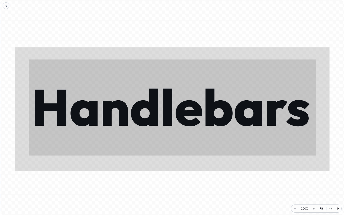
wordmark is about as small as a template gets: one string, one face, one weight. Everything below came from the link's params flowing into {{ }} slots, with no code in between.
Custom helpers. The engine registers these in engine/src/template.ts (the source of truth - this table should list exactly what it registers, no more, no fewer):
| Helper | What it does |
|---|---|
{{default x "fallback"}} | x unless it's null/undefined, then the fallback. |
{{upper s}} / {{lower s}} | Upper/lower-case a string. |
{{eq a b}} | Strict equality - use inside a condition, e.g. {{#if (eq kind "note")}}. |
{{markdown body}} | Render a small Markdown subset (headings, bold/italic, links, lists, code) to safe HTML. Used for blocks bodies and pasted Markdown. |
{{arrow text}} | A leading > < ^ v becomes → ← ↑ ↓ (for directional labels). |
{{asset ref}} | The resolved URL of an asset input. Use in src/href. |
{{asset ref "width"}} | A specific field of the asset (width, height, …). |
{{media ref}} | Emits the right element for any asset kind - <img>, <video>, or a Lottie marker - from one call. Options hash: class, style, loop, autoplay, muted, controls, fit (contain/cover), key. |
The data-format helpers {{icsStamp}}, {{rfcText}}, and {{csvCell}} are for the sibling text templates - see Data formats below.
Styles (styles.css)
Scoped automatically. Write top-level selectors targeting your own classes. Don't write global rules (body, html); they'll be scoped to #tool-canvas and probably won't do what you want.
Data formats (json / csv / ics / vcf)
Some tools export data alongside the rendered image - a calendar invite, a contact card, the underlying numbers. These come from the input model, not the pixels, so they work in every shell (including the CLI) and don't need a browser.
json- no template needed. Add"json"torender.formatsand the export is{ tool, version, inputs: { … } }(the resolved input values), serialized automatically.csv/ics/vcf- add the format torender.formatsand ship a sibling text templatetemplate.<ext>(e.g.template.ics). It's a Handlebars template hydrated against the same context astemplate.html(input values + hookextras), but without HTML escaping - so{{title}}emits the value verbatim. Escape per the target format with the built-in helpers:{{icsStamp meetingTime}}- adate/datetime-localvalue → iCalendar basic form (20260915T143000).{{rfcText x}}- escape an iCalendar (RFC 5545) or vCard (RFC 6350) text field (\;,newline).{{csvCell x}}- quote a CSV field per RFC 4180 only when needed.
Example template.ics (see tools/meeting-planner/):
BEGIN:VCALENDAR
VERSION:2.0
BEGIN:VEVENT
DTSTART:{{icsStamp meetingTime}}
SUMMARY:{{rfcText title}}
LOCATION:{{rfcText city}}
END:VEVENT
END:VCALENDAR
Reference wirings: meeting-planner→ICS, email-signature→vCard, chart-creator→CSV. Raster (png/jpg/webp/avif/gif), svg, pdf, the print/CMYK formats (pdf-cmyk, cmyk-tiff), video (webm/mp4), zip, and ico come from the browser (web shell) or the Tauri-bundled CLI - the node CLI handles only text/data formats. The CMYK formats pair with the convertPaths outlining toggle (see The render block) for fonts-not-installed print fidelity; pdf-cmyk ships on more tools than cmyk-tiff does (a subset) - e.g. qr-code offers both, while wayfinding-signage and event-name-badge ship pdf-cmyk.
Hooks (hooks.js)
Optional. Required only if you need computed values, async data, or anything the template can't express.
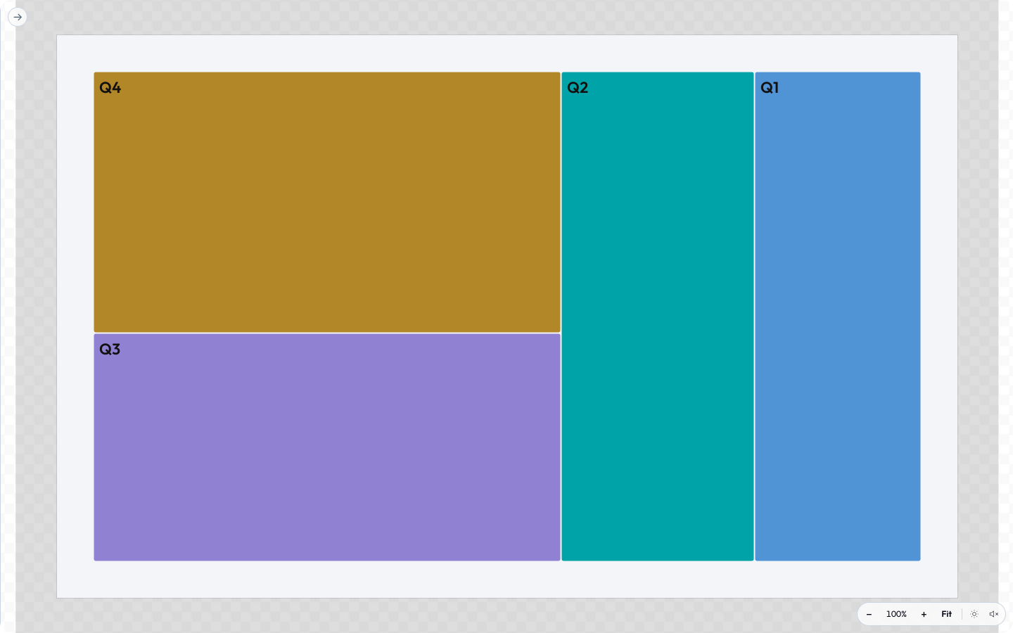
A layout no logic-less template could reach is the sign that you need one. The D3 tool parses its pasted table, runs the layout, and hands the template a finished shape list as extras; the template itself just prints it.
// Top-level functions are picked up by name. Declare any you need.
function onInit({ model, host }) {
  // Run once. Return a patch object to seed derived values.
  return { computedThing: derive(model) };
}

function onInput({ id, value, model, host }) {
  // Run after every input change. Return a patch (or nothing).
  return { computedThing: derive(model) };
}

function beforeExport({ node, format, opts, host }) {
  // Modify the node, or call host APIs before raster/serialize.
}

function afterExport({ node, format, blob, host }) {
  // Fires after the export blob is produced. Cleanup, telemetry, chaining.
}

function exportFile({ model }) {
  // The transform path - for on-device utilities with a `file` input. Read the
  // picked file's bytes and return the transformed file: { bytes, mime, filename }.
  // Bypasses the DOM render/export pipeline entirely. See the `file` input above.
}

function onFrame({ frame, model, host }) {
  // Live camera (v1.4). Runs once per webcam frame so the render reacts to motion.
  // `frame` = { width, height, data (RGBA Uint8ClampedArray), t }. Read pixels
  // synchronously; return a patch like onInput. See "Motion-reactive tools" below.
  return { svgContent: traceFrame(frame, model) };
}
Declared hooks must be flagged in the manifest's hooks object ({ "onInit": true, ... }) - a manifest with no hooks object never loads hooks.js at all, and the flags are what validation and shell affordances (e.g. the transform-download wiring for exportFile) read.
Shared helper regions (community/_shared/)
hooks.js must stay self-contained (no import/require - tools are data), so helpers that several tools need (the filter overlay block, canRaster, loadImage, esc, clamp, safeColor) are maintained once in community/_shared/*.js and copied byte-for-byte into each consumer between marker comments:
// === lolly:shared clamp - generated from community/_shared/math.js; edit there and run npm run sync:shared ===
function clamp(v, a, b) { return v < a ? a : (v > b ? b : v); }
// === /lolly:shared clamp ===
Never hand-edit inside the markers: edit the canonical file, run npm run sync:shared, and npm run validate:catalog fails on any drift. See community/_shared/README.md.
Motion-reactive tools (onFrame)
Declare an onFrame hook and your tool can react to a live camera - the shell shows a "Go live" toggle wherever a camera is available (host.media), and the runtime drives onFrame once per frame. This is pure progressive enhancement: onFrame is never called where there's no camera, so the tool still works as an ordinary still-image tool. Do not add camera to capabilities - that would require a camera and hide the tool where there isn't one.
A frame carries raw pixels (frame.data, RGBA), so the usual move is to wrap them in a canvas the still pipeline already understands and reuse it:
function onFrame({ frame, model }) {
  const c = document.createElement('canvas');
  c.width = frame.width; c.height = frame.height;
  c.getContext('2d').putImageData(new ImageData(frame.data, frame.width, frame.height), 0, 0);
  return { svgContent: build(c, inputsFrom(model)) }; // same builder as onInit/onInput
}
Keep it cheap - onFrame isn't time-boxed, but the runtime drops a frame if the previous one is still rendering, so an expensive per-frame render just lowers the frame rate. The four filter-* tools are the reference (halftone/scanline/posterise/duotone); pixel-tracers wrap the frame as above, while the SVG-filter duotone hands the frame back as a data-URL image instead.
Recording tools (render.capture + onLevel)
Set render.capture and the tool grows a record button that captures the user's mic (and optionally camera) to a file - the audio/video counterpart to the file transform path. Three modes:
"audio"- mic only (a voice recorder). Also shows a live input-level meter when the tool declares anonLevelhook."video"- camera only, silent (no mic track)."av"- camera + mic (a talking-head recorder - use this, not"video", when the clip needs sound); the shell also mounts an audio-level + background-noise coaching HUD.
Recording prompts for a device permission, so - unlike the live-camera onFrame path - it is a gated capability: declare "microphone" for audio, "camera" for video, and both for av. The tool is then unavailable on shells that can't record (the headless CLI provides no host.recorder). The recorded bytes reach the user through the transform path (host.export.file, never watermarked) or become a template asset a compositing tool wraps.
"render": { "width": 1080, "height": 1080, "formats": ["png", "svg"], "capture": "audio", "actions": ["download", "save"] },
"capabilities": ["microphone"],
"hooks": { "onInit": true, "onLevel": true }
The onLevel hook - a live VU meter / sound check. Declare it and the runtime drives it once per audio-level sample (from the pre-record meter, and again during the take), exactly like onFrame drives a camera frame - drop-overlap, not time-boxed. It returns a patch like onInput:
function onLevel({ level, model, host }) {
  // `level` is an AudioLevel (below). Return a patch the template renders.
  return { barPct: Math.round(Math.min(1, level.rms / 0.5) * 100), tooHot: level.clipping };
}
An AudioLevel is { rms, peak, dbfs, clipping, t } - rms (0–1 loudness, the value a VU bar tracks), peak (0–1 instantaneous), dbfs (peak in dB; 0 = clip, −∞ = silence), and clipping (true while peak sits at the "too hot" threshold, ~0.99). Engine v1.19 adds four optional background-noise cues (feature-detect - undefined on shells that don't compute spectral levels): noiseFloor (dBFS floor in the quiet gaps), snr (dB signal-to-noise; ≲15 dB = a noisy room), hum (0–1 share of energy in the mains bands - electrical hum / ground loop), and hiss (0–1 spectral flatness - broadband fan/HVAC hiss). The noise cues are trustworthy only from the raw meter (the sound-check runs the mic with noise-suppression/AGC off); a recording session runs them on for a clean file, so its floor reads artificially low.
voice-recorder (capture: "audio" + onLevel coaching) and top-tail-recorder (capture: "av") are the reference tools; the host.recorder bridge (meter / record) is documented in Host API.
What you can call:
- Everything on
host.*your manifest'scapabilitiesallows. - Pure JS computation.
What to stay away from:
window,document,fetch,localStorage. Hooks are loaded vianew Functionwithhostinjected as closure scope - a portability contract, not a sandbox - so in a browser shell these globals are technically reachable. But leaning on them ties your tool to browser shells (it breaks headless in the CLI) and will break outright when hooks move into Worker isolation.host.*is the only supported surface. (Browser-only paths like theonFramecanvas trick above are the deliberate exception.)- Importing other modules. Hooks are loaded as a single source string, so
importdoesn't work. - Slow work. Async hook results are time-boxed (
onInit5s,onInput2s,beforeExport/afterExport5s,exportFile10s) and a result that arrives late is discarded; a synchronous overrun can't be preempted and just gets logged as a warning.
Newer optional host APIs (feature-detect)
The bridge grows by addition: new host.* APIs arrive in minor engine versions, are never removed, and are optional - an older shell simply doesn't have them yet. Feature-detect and degrade. If your tool genuinely can't work without one, raise the manifest's engineVersion floor instead (e.g. ">=1.60") - the engine refuses to load a tool whose range excludes the running version, which fails clearer than a missing method would. Recent additions:
host.images- on-device image decode / resize / re-encode: the "HEIC to JPEG, compress to WebP, downscale" utility shape as a first-class API. Bytes (or a Blob) in, encoded bytes + dimensions out;decodereports EXIF-oriented dimensions and a MIME type sniffed from the bytes;resizenever upscales;encodeconverts towebp/jpeg/png(it reads more formats than it writes); an animated source flattens to its first frame. Read the result'smime/width/heightrather than assuming the request was honoured exactly - a shell may fall back (e.g. PNG where WebP encoding is unsupported). Not gated by acapabilitiesflag:if (host.images) …and degrade where it's absent. Everything runs locally; the bytes are never uploaded.host.geom(v1.64) - exact vector geometry: path booleans (union/intersect/difference/xorover an array of paths, plusselfUnionfor the canonical form of one),offset,stroke(a stroked path in, a filled outline out),simplify,fromNodes+continuity(pen-tool node lists with handles and a continuity constraint), and measurement (bounds,area,contains,winding,nearest, which reports the contour / curve /tto split at). The currency both ways is an SVG path-data string - the thing already in your template, your state and your URL - withparse/toPathDataexposing whole cubics for callers that want to walk the curves. Nothing flattens or samples: results stay real Béziers. Failures are returned, not thrown - every method answers{ ok: true, … }or{ ok: false, code, message }, soif (!r.ok) …and render something sensible; a throw out of a hook would only be logged and discarded, leaving your tool silently unresponsive. Thecodetells you what to do:'invalid-path'(malformedd- reject it),'too-large'(past the parse ceilings, whichlimits()reports),'limit'(the answer exists but this engine won't guess at it past its bounded-work ceiling - retry with simpler operands or a coarsertolerance),'invalid-argument','unsupported'.ok: truewithd: ''is an answer - a legitimately empty region (a non-overlapping intersection, an over-shrunk offset) - not a failure. Path data is parsed defensively, so a pasted or URL-supplieddis safe to hand straight in. Feature-detecthost.geom.
``js function onInput({ values, host }) { if (!host.geom) return {}; // older shell: leave the path alone const cut = host.geom.difference([values.shape, values.hole]); if (!cut.ok) return { pathError: cut.code }; // never silently wrong const outline = host.geom.stroke(cut.d, 4, { cap: 'round', join: 'round' }); return { shapePath: cut.d, outlinePath: outline.ok ? outline.d : '' }; } ``
host.text.fontUrl(family, { weight?, italic? })- resolve a font family the host knows (brand statics, user-uploaded faces, on-device Google Fonts, the platform face) to a fetchable font file usable asfontUrlinhost.text.toPath()/preload(). A variable face comes back with thevariations(e.g.["wght=700"]) needed to reach the requested weight - pass them through totoPath(), which otherwise shapes the default instance. Resolvesnullwhen no file can be found for the family, so keep your<text>/CSS fallback. Feature-detecthost.text?.fontUrl.
Network access (host.net)
Tools are offline-first: by default a tool cannot reach the network at all. A live-data tool (weather, status, an RSS ticker, an iCal feed) opts in with two manifest declarations - the capability, and an explicit allowlist of what it may fetch:
"capabilities": ["network"],
"network": {
  "allowlist": [
    "https://api.example.com/*",
    "https://example.com/status.json"
  ]
}
The allowlist rules:
httpsonly. Entries are full URLs; plainhttpnever validates.- A bare entry allows that exact URL only - byte-for-byte, query string included.
- *A trailing
/makes an entry a prefix wildcard* -https://api.example.com/allows everything under that path. The wildcard must follow a path separator (/, never a bare), so a prefix can't bleed into a lookalike host:https://api.example.com*would also matchhttps://api.example.com.evil.io/. - 1-32 entries. Small by design - name the endpoints you actually call.
- Fail-closed everywhere. No
networkblock, or a URL no entry matches, means everyhost.net.fetchrejects - identically in the web shell, offscreen batch/gallery renders, the CLI and the TUI. The host applies the allowlist per mounted tool; nothing a hook does can widen it. Response bodies are also size-capped (64 MB), so a wrong or compromised endpoint can't stream unbounded bytes into memory.
In hooks, host.net.fetch is an ordinary fetch - just gated:
async function onInit({ model, host }) {
  try {
    const res = await host.net.fetch('https://api.example.com/v1/status');
    if (!res.ok) return { statusText: 'unavailable' };
    return { statusText: (await res.json()).status };
  } catch {
    return { statusText: 'offline' }; // the tool must still mount without a network
  }
}
Keep fetches inside the hook time budget (onInit 5s, onInput 2s), return template-ready extras, and always render something sensible when the fetch fails - a network tool that renders blank offline is a bug, not a constraint.
Composition (composes)
A tool can embed another tool's rendered output as an image instead of re-implementing it. Declare it in the manifest and reference it in the template like any asset - no hook code, no copy-paste.
// tool.json
"capabilities": ["compose"],
"composes": [
  { "id": "badgeQr", "tool": "qr-code", "format": "svg",
    "inputs": { "url": "{{url}}", "color": "#0c322c", "join": true } }
]
{{!-- template.html - guard it: composition can fail gracefully --}}
{{#if badgeQr}}<img src="{{asset badgeQr}}" alt="">{{/if}}- Each entry renders
toolwithinputsand exposes the result underidas an{{asset <id>}}extra (the same store hook-computed values use). - String
inputsvalues are Handlebars, hydrated against your tool's own context (its input values + extras), so a child input can bind to a parent value - e.g."url": "{{url}}". format(defaults to the child tool's first declared format,render.formats[0]) fixes the child render;width/height(px) default to the child's native size. Compose any tool's render: ansvgchild stays a true vector when the parent exports to SVG or PDF and rasterises crisply for PNG; raster children (png,jpg/jpeg,webp) embed as images.svgis the only format wired declaratively today (event-name-badgecomposesqr-codeassvg) and is the best-supported. The enum also listspdf, but a PDF child is not supported as a source - nothing inlines a PDF blob, so don't setformat: "pdf". HTML / Markdown / plain-text composition is not supported.- The composed value is a normal asset URL, so it works in a CSS
url()background just as well as in an<img src>- bring another tool in exactly like a library image. - The child renders through the same engine path (pixel-identical) and is never watermarked or provenance-stamped (it's an intermediate). Recursion is depth- and cycle-guarded:
a → b → afails gracefully and the slot stays empty, so always{{#if}}-guard the reference. - Works wherever the shell can render the child to bytes; the lean CLI composes
svgchildren. The mechanism ishost.compose- see Host API. - End users get this too, without a manifest. Any
assetinput can take a pasted Lolly tool link (seeasset- library or device upload above); the host renders it through the samehost.composepath.composesis for renders you wire into the layout; the pasted-link path is for the user to choose which tool fills an image slot.
Composition depth and baking
Nesting is capped at 3 levels - a tool composing a tool composing a tool. A deeper chain fails the same way a cycle does: gracefully, with an empty slot. When a design genuinely needs to go deeper, bake the inner render: tick Freeze as a static image in the picker's render card. A baked image is a frozen copy - self-contained bytes that consume no nesting depth and never live-re-render - so it won't update when the source tool changes. Its slot shows a "❄ baked from …" row with a Re-bake button (and an Edit path into the source tool's inputs) that re-renders on demand, so a stale copy is one click from fresh.
Brand logo (auto-switching)
The catalog ships the SUSE logo as 8 variants under suse/logo/ - {hor|vert}-{neg|pos}-{green|white|black} (hor/vert = wide vs stacked; neg = for dark backgrounds, pos = for light; green is the brand mark, white/black are the high-contrast mono pair). A tool shouldn't hard-code one - it should pick the variant that fits the current background and space, and use the actual SVG image (this is distinct from brand-lockup, which renders the wordmark from the SUSE font, outlined via HarfBuzz host.text).
The pattern: a hook chooses the id, resolves it with host.assets.get(), and hands the template a ready <image>/<img>:
// hooks.js - WCAG luminance decides neg/pos; orientation + ink come from inputs.
function logoId(inputs) {
  const dark   = relLuminance(inputs.background) < 0.5;   // dark bg → neg
  const orient = inputs.orientation === 'vertical' ? 'vert' : 'hor';
  const ink    = inputs.ink === 'mono' ? (dark ? 'white' : 'black') : 'green';
  return `suse/logo/${orient}-${dark ? 'neg' : 'pos'}-${ink}`;
}
async function onInit({ model }) {
  const inputs = Object.fromEntries(model.map(i => [i.id, i.value]));
  return { logo: await host.assets.get(logoId(inputs)) }; // → extras.logo (an AssetRef)
}
<!-- template.html - the actual SVG asset, not a font lockup -->
{{#if logo}}<image href="{{asset logo}}" .../>{{/if}} <!-- inside an <svg> → true vector export -->
{{!-- or, in an HTML canvas: --}}
{{#if logo}}<img src="{{asset logo}}" alt="Logo">{{/if}}Putting the <image> inside an <svg> lets the export inline it (data-URI) and emit true vector SVG; an <img> in an HTML canvas exports raster/PDF only. tools/tool-logo/ is the reference implementation (background colour, orientation, brand/mono, transparent-bg export). Reusing this in another org: keep the structure and swap the suse/logo/... id prefix for your own logo namespace (same variant matrix).
Brand overlays (extends)
A brand pack that only needs to tweak a community tool - a different template, a handful of re-worded translations - shouldn't carry a whole fork that silently drifts from its base. Instead, declare the brand's tool dir an overlay:
// brands/<brand>/tools/<id>/tool.json - same id as the community tool
{
  "id": "color-palette",
  "extends": "community",
  ...
}
and keep only the files that differ in the overlay dir. When scripts/use-profile.ts builds the tools/ view, that tool's view dir becomes the per-file union of the base (community/<id>/) and the overlay (brands/<brand>/tools/<id>/):
- Overlay wins on any filename collision; everything else comes from the base.
- Composition recurses one level into subdirs (
i18n/,assets/) - files there union per-file too; anything nested deeper is taken wholesale from the winning side. - The
extendsfield is stripped from the composedtool.json, so the engine, shells, and catalog scripts always see a plain tool. That one file is materialised (a real file, not a symlink) - edit the pack source, not the view copy; every other composed file keeps normal write-through symlinks in local (symlink) mode, and the Vercel copy mode composes identically. - Overlay and base share the same tool id (ids are permanent contracts; the view path
tools/<id>/never changes), so the overlay'stool.jsondoubles as the marker carrier even when it's otherwise identical to the base's.
Fail-closed: a declared overlay whose base is missing (community/<id>/tool.json doesn't exist), an extends value other than "community" (the only base pack in v1), or an extends declared on a community tool itself fails the profile build loudly - even in postinstall --auto - and is also rejected by npm run validate:catalog. You never get a silent partial tool. The composed result is validated like any other tool, since the validator runs against the tools/ view.
Publishing
There are two ways a tool ships - pick per context:
- In the app, no build step. In the open Lolly app, save a Layout Studio editing session and it becomes your own tool on your device - no
tool.json, no catalog build, no git. Anyone using the open version can do this; it's the fastest path for a personal or team tool. - Into a catalog, for a shared library. To publish a hand-authored tool into a catalog that many people sync - the model an organisation can manage as a Git repo so every change gets review and an audit trail (an option, not a requirement) - add the folder and rebuild the index:
- Place your folder under
tools/. - Run
npm run build:catalog- this regeneratescatalog/tools/index.jsonfrom
the manifests (don't hand-edit the index; it's generated) and refreshes asset checksums.
- Run
npm run validate:catalogto confirm the catalog is consistent. - Build & deploy the catalog. The shell picks it up on next boot.
For development:
npm run dev:web
# open localhost - your tool appears in the gallery
Localizing a tool
A tool's user-facing strings live in the manifest (English by default). To translate it, add an i18n/<lang>.json sidecar - a sparse, flat, dotted-path overlay of just the strings a translator touched:
// tools/your-tool-id/i18n/de.json
{
  "name": "…",
  "description": "…",
  "inputs.headline.label": "…",
  "inputs.headline.help": "…",
  "inputs.size.options.a4": "…"
}
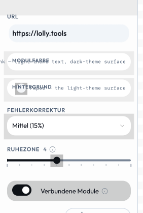
The same sidebar, opened with ?lang=de: labels, help text and select options all come from the sidecar, and the tool code is untouched.
When a tool loads with a language set (the reserved lang URL/CLI param, or the user's profile language), the engine best-effort fetches the matching i18n/<lang>.json and merges it onto the manifest before any shell or the input model sees it - one overlay point, every shell (web, CLI, TUI) benefits. Anything missing - no sidecar, an absent key, a malformed file - falls back to the manifest's English, so a translation gap never breaks a tool load. Keys cover name, description, a11yLabel, and per-input label / help / placeholder / section / suffix / options.<value> (block and vector sub-fields as inputs.<id>.fields.<fieldId>.…). validate:catalog checks the keys, so a typo is caught at build time rather than silently ignored.
- Pre-fill the user's language. An input can declare
bindToProfile: "lang"to seed from the active language (a canonical short code -en,de,ar, …). - Right-to-left. Arabic and other RTL languages mirror the whole UI. Author your template and CSS so they mirror too - prefer logical properties and
[dir]-aware rules over hard-coded left/right - and the shell sets document direction from the active language.
Example tools
tools/color-palette/- pure declarative, no inputs, asset reference onlytools/qr-code/- useshooks.js(onInit/onInput/beforeExport) to encode the QR matrix; composed as ansvgchild byevent-name-badgetools/quotes/- multi-input form withlongtext,select, andassetinputs withallowUpload: true(personal-image library)tools/meeting-planner/-blocksinput for repeating rows;onInit/onInputshaping; ICS data exporttools/color-block/- advancedblocks: typedaddMenudiscriminator +showFor/multilineForheterogeneous rowstools/wayfinding-signage/-blocksrows that auto-shrink label text to fit (or show a sponsor image), and asizeselect that drives the print page size; CMYK exporttools/tool-logo/- auto-switching brand logo: a hook picks the rightsuse/logo/SVG by background/orientation; true vector SVG exporttools/bag-video/- video/gif output withrender.videotiming config